

Photography backdrops: 4 ways of choosing yours
Posted by FONDOS PARA FOTÓGRAFOS

We wanted to create this post for all those who find it difficult to pick photography backdrops for your next shooting session. Today, we are over-saturated with options and many times we get blocked and no longer know what we were going to buy. We will do our best to help you!
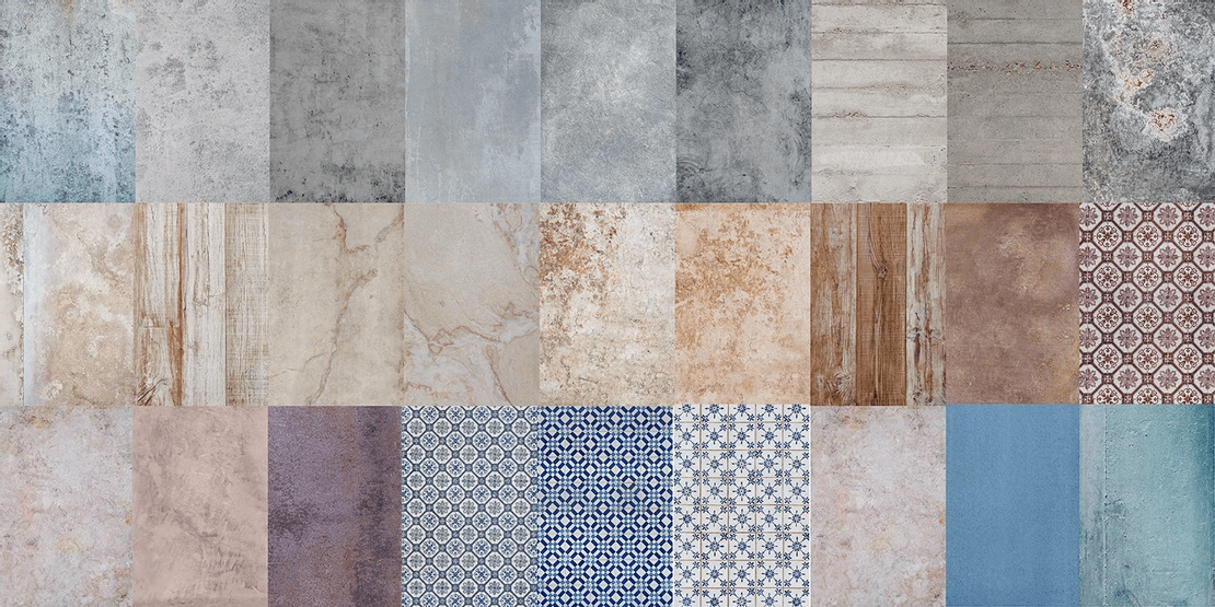
As you may already know, the high quality photography backdrops that we produce have several characteristics that make them ideal for food and product photography, for both amateur and professional use. Firstly, they are backdrops of great photographic realism. Secondly, they are flat, resistant and flexible. Moreover, they can be cleaned after use and can be stored rolled up, remaining flat again after removing them from the tube.
In conclusion, once we choose the material, we have to choose the backdrops that are going to become the foundation of our scene.

If you search on Google, you will probably find advice on what to consider when choosing a photographic backdrop. The recommendations are, for example, that the backdrop should not be distracting as this would draw attention away from the subject we are going to photograph. Also, some others say plain backdrops are the most versatile, since textures can be more difficult to combine harmoniously. Or that the most basic backdrops that everyone should have are a black and a white one.
All of this no longer has to be this way. We were both tired of seeing photographs with a black or white backdrop. However, there is a whole international community of photographers who use wonderful and original textures, who are challenging the way in which we see and consume photography in general and food photography in particular. And so we decided to start creating our own textures and using them in our sessions.
In this article, we'll talk about how we organise our backdrops and why we choose which photo backdrop to use on a professional level. Getting the backdrop right is key to getting a good foundation on which to build a scene, no matter how simple that scene is. And a good scene means a great part of what you need to get a great photo.
There are 4 main aspects that we look at when choosing which backdrops to use for our next food photography session. By the way, in this post we are going to focus on our specialty, which is food photography, although it could be an interesting read for those interested in product photography, art direction or culinary styling. What we offer is a 4-step visual analysis of our backdrops.
This will allow you to choose your backdrops with complete confidence that it will be the foundation on which to create spectacular photos of your dishes!
These steps can be done in any order. You can do one or all. The goal of this article is to provide a simplified form of visual analysis that can be used as a starting point
1. CHOOSE THE BRIGHTNESS (VALUE) OF PHOTOGRAPHY BACKDROPS: Dark, light or neutral backdrops
When we think about how light or dark our backdrop is, we should think about whether we want our scene to be more dramatic or more neutral. In food photography this will be crucial as it is one of the most direct ways of impacting the viewer.

A scene with a high key, for example, is a scene with clear elements that make us emotionally perceive it as clean, fresh and daytime. The light-weight scenes lighten the food itself.
Dark Backdrops

Dark backdrops have character and are dense and heavy. They tend to work in low-key and are the most difficult backdrops to use. This is for the following:
- Camera quality
- Glitter
- Light control


Creative photo by @thehealthysins, @gorostizaphotography, @addictedtohummus, @pucheroestudio
Light Backdrops

Light backdrops are lighter in weight. They usually work in high-key. They are difficult:
- The most common mistake is over exposing the backdrops clear. Let them come out burned.
- Light control
- If the scenes are not styled well, the photo can be bland.


Creative photo by @eatbyale, @theannasloft, @soycristinanavarro, @addictedtohummus, @pucheroestudio
Neutral Value Backdrops
Neutral backdrops in terms of luminosity are the most versatile. Most of our catalog is neutral, for that very reason. They are also the easiest to use because:
- Getting a correct exposure is so easy it can be done with a cell phone.
- They give less brightness than dark backdrops.
- They work well in all lighting conditions and all kinds of scenes.


Creative photo by @thehealthysins, @inesananashortela, @addictedtohummus, @naturallynatalia_, @pucheroestudio
2. CHOOSE THE TONE OF PHOTOGRAPHY BACKDROPS: Cold, warm or neutral
Normally, the next thing we choose is the tone. This decision is related to the color of the scene. Ideally, you should have prior knowledge of color theory, but you can also skip this step by simply having good intuition.

Generally, the photo filters used on Instagram are basically a tone layer. In the fitness and foodie world they tend to be warm: browns and oranges. Instead, the filters you see for a Nordic adventure in Iceland are cold: blue and green. In gastronomic photography we recommend not applying tone filters, since they do not usually sit well with food. Instead, you can play with the tone in the backdrop and the props to accompany the food and convey the sensations we are looking for.
Cold Backdrops

Violet-Blue-Green
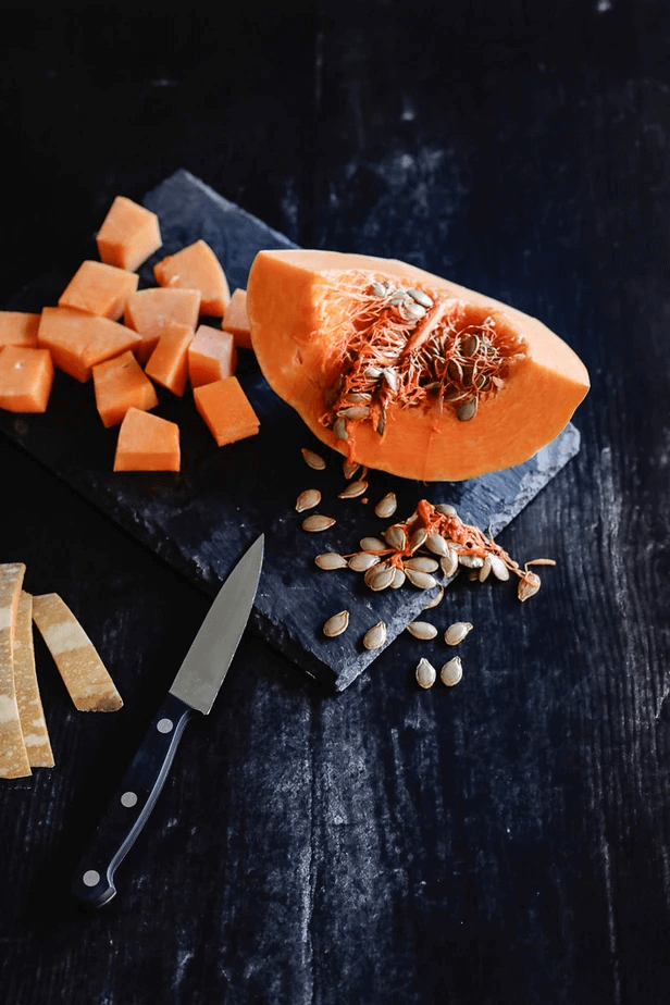
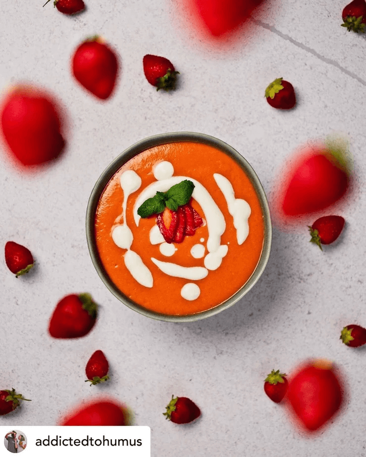
Most of the food we eat is warm, so we can use cold backdrops to give us a contrast in tone. For example, this pumpkin soup on our Cíes backdrop or the orange and red tomatoes on Tirso.


Creative photo by @soycristinanavarro, @thebiteshot, @addictedtohummus, @pucheroestudio
Warm Backdrops

Yellow-Orange-Red-Brown
Cos these backdrops we will achieve harmony of warm tones. Pay special attention not to get lost in the backdrop. Here we show you examples of tonal harmonies where the subject stands out from the backdrop.


Creative photo by @soycristinanavarro, @addictedtohummus, @pucheroestudio
Neutral Tone Backdrops

We consider neutral backdrops those that have a subtle tone. However, so are white backdrops and black backdrops. For example, our Madrid fund. It has a subtly cool hue, but it's almost white. This makes it a tremendously versatile neutral backdrop.


Creative photo by @soycristinanavarro, @addictedtohummus, @naturallynatalia, @eatbyale, @pucheroestudio
Creative photo by @eatbyale, @naturallynatalia, @soycristinanavarro, @addictedtohummus
3. CHOOSE THE SATURATION OF PHOTOGRAPHY BACKDROPS: Saturated or desaturated
Saturation has to do with the intensity and amount of color that the photography backdrop has. There are many color saturated foods such as vegetables, fruits, herbs, or berries. It is not by chance that they have these colors since saturated colors attract a lot of attention, and it is a way that these plants have to attract attention in nature. Saturated elements when used well can be spectacular to look at.

As with hue, we recommend getting the saturation of our image from the physical elements in the scene, and never through editing.
Desaturated Backdrops

As a general rule, our photography backdrops tend to be low saturated. At the beginning of this article, we commented that it is important that the backdrop does not draw too much attention away from the subject. For example, if we put these peppers on a saturated backdrop they will stand out less. If, on the other hand, we use a backdrop with little or no saturation, all the color will be concentrated on the subject, making them attract much more attention.
A slightly saturated photography backdrop is a safer and more versatile bet. It will give us a more natural result. A more realistic image. And they are easier to use. Like in this image with our Simon backdrop.


Creative photo by@puntodevistasevilla, @addictedtohummus, @inesananashortela, @naturallynatalia, @thehealthysins, @pucheroestudio
Saturated Backdrops

Saturated photo backdrops can give very attractive results and saturated plain backdrops have been used by big brands for advertising campaigns for many years. They give a more dreamlike image. More surreal. They are more difficult to use because the editing is more complex. And having large masses of very intense color, it is essential to have knowledge of color theory to achieve harmonic combinations.
A saturated backdrop is a very good idea, when you want use negative space on your image. The backdrop will attract the viewer's attention because of its color and then it will redirect the gaze towards the subject. For example, in this image of the Poké Bowls on our Almería backdrop.


Creative photo by @thebiteshot, @addictedtohummus, @pucheroestudio
4. CHOOSE THE TEXTURE OF PHOTOGRAPHY BACKDROPS: the most intuitive choice
Our backdrops are photographic copies of real textures. So, if you are looking for a realistic image for a food photography scene, your thing is that you choose textures that you would like to have in the kitchen or on the dining room table. A marble countertop or a wooden table are the favorite options for most. The stone may remind you of a more modern, industrial kitchen. The same goes for rust. Hand-painted backdrops can be more homemade. And rust could go well, for example, to portray Asian fast food.

With this we want to express that the texture has to do with our associations and conditioning. With which it is a very personal characteristic. The exercise of creating scenes with different textures and trying combinations is very fun.
CONCLUSION
We have lovingly written this article to try to explain and simplify complex concepts. Always with the intention that they are useful resources for everyone.
For everyone who wants, we propose this learning scheme that can make your photography of a radical change in a short time.
Observe: First we find a photo that we like
Analyze: We analyze that photo with all the tools at our disposal. For example, you can analyze what backdrop has been used in the image. We are left with a challenge. For example, try a photo with a light backdrop in high-key (without scorching the photo)
Experiment: We conducted the photo shoot with the emphasis on overcoming our own challenge.
Observe again: Finally, we look again and see if we like the result, if we liked the process, etc. And we find another photo that we like and start over.
In this article we have seen 4 characteristics of our backdrops and how you will have seen in all of them there is a class that is easier to photograph, for technical reasons. We thought that you might want to have all the funds that meet these characteristics so we have created a category specifically designed for photographers who are just starting out. We have called it like this:

With everything and with that, knowing how to analyze a backdrop is only the beginning to be able to take a photograph of food that looks professional. If you are interested in this path, you can keep an eye on our next articles.
The truth is that we are always looking for ways to improve our food photography. We are always learning from you and from all the photographers we can. In fact, a large part of what we know comes from other photographers and experts in the industry. So if you have ideas about this article and want to comment on them, please do not hesitate to write to us.
"